M&S re-launch
This week saw the launch of the new Marks and Spencer (M&S) site, http://www.marksandspencer.com. As with any high-profile, high-street brand investing in a new website, interest from the UX industry is high regarding the design decisions they’ve taken, and the resulting user experience. I have to admit to not being a usual M&S shopper (on or offline), so this post doesn’t seek to compare the old with the new, but I intend to discuss which elements of the site’s user experience perform well, in my opinion.
Initial thoughts
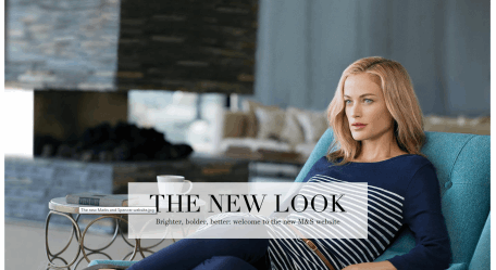
On initial homepage load, I thought I was being shown a splash/interstitial page (i.e. no navigation, sparse content), which surprised me:
However, a few seconds later a transition brought the full homepage into view:
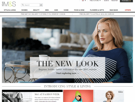
I assume this transition effect will be dropped in the future (they certainly aren’t using cookies to disable it on subsequent visits), but following the re-launch it certainly focuses the user on the ‘new look’ message before the full site content is presented.
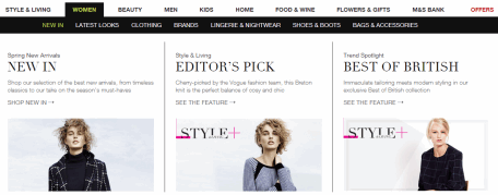
Navigation
The navigation design and layout is reminiscent of other high-profile retailers, with a sparingly-used colour palette ensuring the eye is drawn to the products rather than the navigation:

Lower-level navigation options are displayed on rollover via the ‘mega-menu’ design pattern, which is regularly seen across large retailers’ sites. In the case of M&S, it’s initially used quite sparingly, with only the secondary navigation options being shown on rollover of a primary category:
From here, a tertiary set of options is presented on rollover of a secondary category:
While this is an effective way of illustrating choices to the user and of structuring those choices to help them understand the hierarchy of the site, M&S falls foul of a usability issue often seen when mega-menus are deployed with hover interactions:
In the screenshot above, the secondary list of options (“New In” etc.) is presented on rollover of “Women”. However, to get to “Bags & Accessories” on the far right, the user has to move their cursor across a wide horizontal axis, while at the same time having to remain within a much smaller vertical axis. The net effect is that often they will rollover another primary navigation option (e.g. “Beauty”), hiding the “Women” secondary nav they were trying to interact with.One alternative would be to present both secondary and tertiary navigation options at the same time on rollover of the primary navigation:
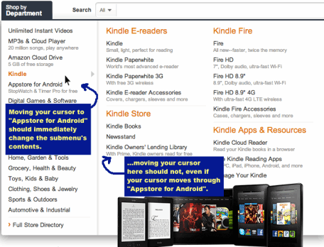
However, I’m assuming M&S took a deliberate design decision to not overwhelm the user with all secondary and tertiary navigation options when interacting with the primary navigation. As such, Amazon’s method for detecting the direction of the mouse cursor (using something like jQuery-menu-aim) may be a better solution to help iron out this usability issue:
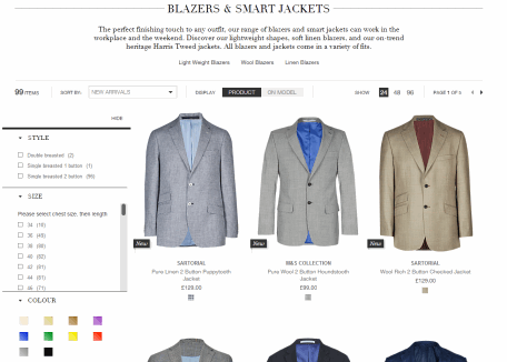
Category page
Having drilled into a product category (e.g. “Blazers”), M&S has done a great job of using typography, white-space and a muted palette to ensure that the products take centre-stage even when there are a number of other User Interface (UI) elements to house, such as titles, category descriptions, sub-navigation, product ordering and faceted filters:
Some nice touches in the UI include:
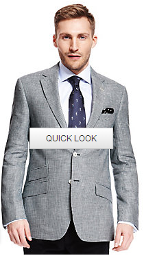
- The “Quick Look” feature that allows the user to rollover a product image to view an alternative product shot
- Additional filters being presented to the user upon selecting a product filter
Product page
Again the product page brings the high-quality product imagery to the forefront (and includes a full image zoom), while ensuring the user is effectively guided through the buying process:
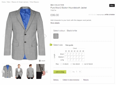
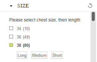
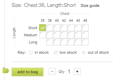
In the example above there is a single colour option for the product, so the focus for the user is to select a size using the size guide matrix. The matrix provides an at-a-glance view of product availability across different combinations of length and chest sizes, and allows a user to rollover an option to see the price and whether the product is in stock:
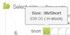
This is a simple but effective touch, and once selected, focuses the user on adding the item to the bag:
Confirmation of the item being added is shown to the user from the bottom of the page, using a pop-out from a docked toolbar which is locked to the bottom of the browser window:
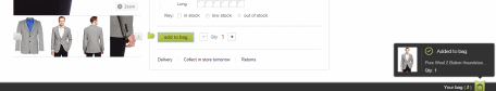
This locked toolbar ensures that on longer pages, a user doesn’t ever lose site of the “Your bag” call-to-action; a subtle design solution for continually prompting the user to make a purchase.
Shopping bag
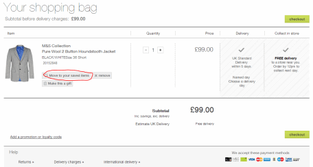
As with the rest of the site, M&S’s shopping bag element is well-designed, with a subtle palette, strong product imagery and a visual hierarchy that allows the user to confirm their selections while nudging them through the buying journey. For a user that may be having second thoughts about a product, the “Move to your saved items” feature is a neat way of allowing them to keep an interest in a product, without taking it through the rest of the checkout process.
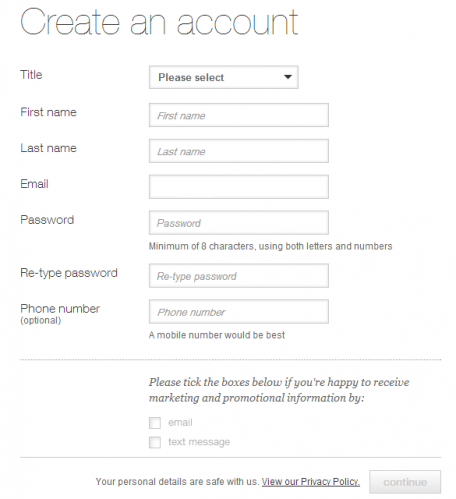
Checkout
Up until this point, I had been impressed with the purchase journey through the site. However, when reaching the checkout I was surprised to see that M&S had made the design decision to insist that new users create an account upfront, prior to making their first purchase:
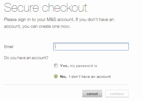
This adds an unnecessary level of friction into the shopping journey, and could be improved by allowing a user to complete an order without creating an account first, then prompting them to do so once the purchase had been made; not least as by that point M&S could have already captured a number of the details they would typically ask for to create an account through the process of fulfilling the order.
At this point, my interest in the jacket I was looking to purchase waned, (although I appreciate this has more to do with the nature of my interest in the site than my sartorial preferences). However the point remains that a more elegant way of prompting users to create an account could have been found.
Overall impressions
In terms of visual design, typography, page layout and the hierarchy of the content I was impressed with M&S’s new site.I only drilled down through a few key pages (Home > Category > Product > Order bag > Checkout), but in my opinion the overarching user experience is well thought-out, consistent between pages, with a strong emphasis on the products (which are beautifully presented), and moving the user through the buying process. Apart from the issues I noted, I personally think it’s a great site; one that almost compels me to become a more regular M&S customer. Almost.
A final thought…
I do note that M&S didn’t plump for a full responsive design. Instead they serve a separate ‘m.’ site to mobile users (and a review of this may be worthy of a separate post), but they’re still making use of media queries to optimise the layout for wider screen users. I’d love to hear more about the design decisions behind this.
To find out how Box UK can help you deliver a user experience that drives customer satisfaction and business results, visit the UX & Design section of our site.
