You don’t have to be a User Experience (UX) expert to spot badly-designed, frustrating and downright unhelpful user interfaces or web pages. In the industry we often refer to these bad designs as “anti-patterns”. Dark patterns, however, are something else entirely.
Dark patterns are anti-patterns with a nefarious purpose – intentionally flawed designs. These are carefully-crafted ‘bad’ designs; built with a pinch of psychology and a healthy dose of trickery. They are called dark, because their goal is often manipulative and used against the user, rather than for.
You might also hear them being referred to as “The Dark Arts” or “The Dark Side”, but we’re going to avoid any Harry Potter or Star Wars references in this article and stick to “dark patterns”.
Talk to one of our digital experts
Tom Houdmont
Head of Business Solutions
Do you have an idea or a project you need support with?
Tom leads Box UK’s Business Solutions team and has over 15 years experience in the web industry. Tom is passionate about creating impactful solutions that solve real problems and deliver the outcomes our clients need.
Dark patterns are used in various forms, not just online but in real life too. It is important to be aware of such trickery so that you don’t fall foul of any deviant intent, or at least reduce the risk of these clever ploys influencing your decision-making.
The subject of dark patterns is huge and we’ve selected just a few cases – both physical and online – to highlight here. We feel that we should warn the reader: almost deviantly in itself, once you start reading into this extremely interesting subject it’s rather hard to stop…
Menu Psychology
There are many examples of dark patterns around us, many of which we are probably not even aware of. More often than not, the aim of using dark patterns is to maximise a company’s profits. This is achieved by using persuasive psychological techniques on customers so that they subconsciously behave how you want them to.
New York Times writer Sarah Kershaw wrote a very interesting piece about the use of psychology in the hospitality industry –where these techniques often get applied. However, it can apply anywhere where items and their prices are listed.
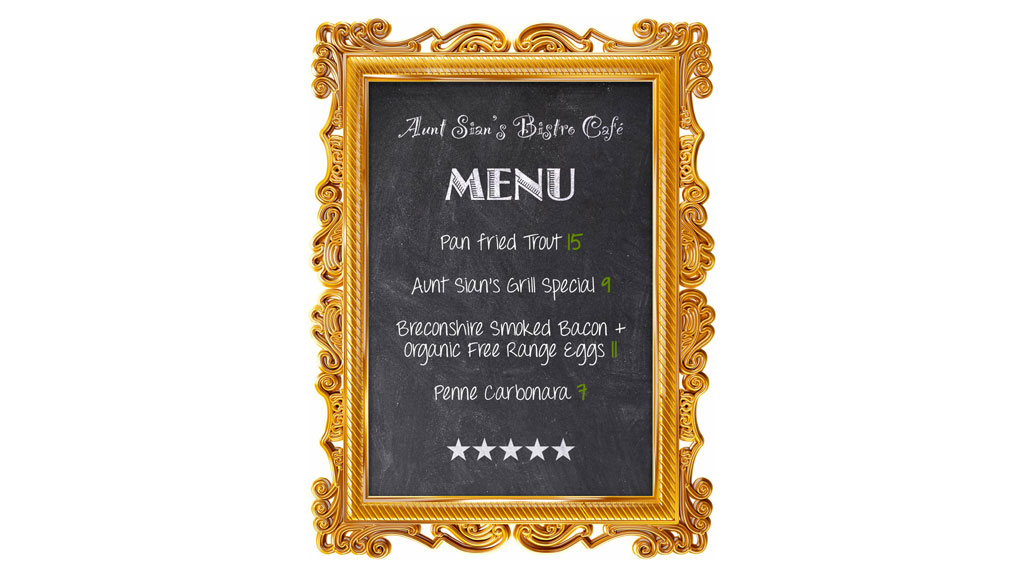
Take this menu for example:
First off, the prices here contain no currency sign – a money symbol reminds the customer instantly that they are spending money. Without, it takes that connection away and makes the whole process less about what the customer is losing from their pocket. Sarah noted that a 9 on its own looked “a lot more manageable” than $9 or £9, and even more rounded and manageable than an $/£8.99.
Calling the menu (or café) “Aunt Sian’s” is creating a sense of familiarity, a sense of something that is well loved; that has tradition. Humans prefer this personal connection to things and, in this case, it makes the menu/café seem that little more friendly, trusted even – suggesting these recipes have been handed down from generation to generation.
Emotive labels are also used – in this example, with “Breconshire” and “Organic Free Range”. These are vivid adjectives, creating again the sense of locality – people prefer local produce – and taking advantage of the idea that organic food is a great deal more attractive than processed foods. These “enhancers” add perceived value to the items and help convince people that eleven dollars/pounds is a reasonable price for what is simply bacon and eggs.
All of the meals have also been strategically placed. At the top is a meal costing fifteen pounds, while at the bottom is the cheapest meal at seven pounds. These are decoys that make the meals in the middle look more reasonable. This is known as price framing – and customers are more likely to go for the meals in the middle than the most expensive or cheapest options. Restaurants will actually often buy fewer ingredients for the decoys, safe in the knowledge that they will not sell very many of those meals.
As you see, these quite simple techniques – of which there are many more – can subconsciously persuade the customer to behave in a certain way and can also be applied elsewhere; online retail for example.
Dark Patterns on the web
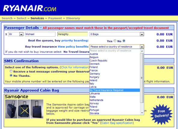
It’s almost impossible to discuss the subject of dark patterns on the web without bringing up one of the best, most well-known examples – the Ryanair insurance opt-out from their 2010 website.When booking a flight, there was a drop-down field for buying travel insurance along with your flight. The default option on the box reads: “Please select a country of residence”. When a user clicked on this drop-down, the option: “No Travel Insurance Required” was buried in an alphabetical list of countries between Latvia and Lithuania.
Ryanair’s drop-down travel insurance menu
This is an excellent example of the “anti-scan” trick, playing on the fact that normal users quickly scan over content on the web rather than reading it fully.
Many users will simply see the words “Please select a country of residence” and naturally assume it’s just another benign question on the form. Hiding the opt-out message in the list reduces the chance that such a user will see it and realise what they’re actually selecting – arguably an anti-scan trick within an anti-scan trick.
Further to all this, it’s interesting to note what happened when a user tried to submit this form without selecting anything. Only the drop-down box was highlighted, drawing the eye to the innocuous: “Please select a country of residence” message and not the label explaining what the user is selecting.
We should note that Ryanair have since made some changes to this form – possibly as a result of experts and critics using them as an example – but there are still many other examples of intentionally misleading design out there.
Opt-out vs. opt-in
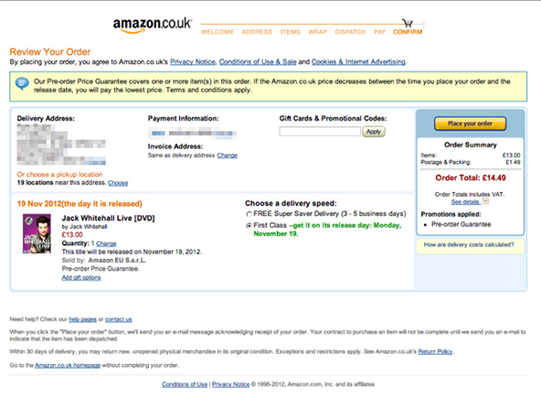
It’s well documented that requiring users to opt-out of something, rather than opt-in, will result in vastly increased numbers of users choosing those options – albeit accidentally. Pre-selected defaults for marketing emails or postage, hidden costs, or items added to a shopping basket without warning for example (the “Sneak into Basket” pattern), are seen all over the web.
A good example of this is the final basket on Amazon, where they pre-select the most expensive postage option for you!
Amazon’s checkout process
In conclusion
The two questions that people come away with when they learn about dark patterns are “Is this evil?” and “Should I do this?”. The simple answer to both is, “Yes. No. Maybe. It depends.” Is a dark pattern still a dark pattern if it is used to increase donations on a charity website for example? Yes of course, but obviously the moral dilemma here is more complicated!
Competitive corporations, target-based metrics, and plain greed make these techniques very tempting to use. At Box UK we’re passionate about UX, so we naturally think of the user first in order to make their journey an easy and enjoyable experience – to create experiences that users will want to return to. Unfortunately, not all agencies or companies think the same way.
Many of the techniques used can be of benefit to the user, influencing them to proceed along a certain path through your website, drawing the eye to the main call-to-action on a page, etc. The ‘dark’ in the name refers to the intent of the designer. On the flip-side, the same techniques can often be used positively – Stephen Anderson is just one leading UX practitioner who focuses on how some of these techniques can instead be used for positive and engaging end-user experiences, and we strongly recommend checking out some of his work.
What you should take away from this article, and any other further study of dark patterns is this: be aware of how you’re influencing your users. As a designer almost every decision you make will influence the end user in one way or another, so be cognisant of this.
To learn more about the UX services we offer at Box UK, visit the User Experience & Design section of our site – and get in touch with a member of our team to discuss how Box UK may be able to help you achieve your specific project and business goals.
Gemma Helyer
Senior UX Designer
Gemma is a Senior UX Designer who specialises in inclusive and accessible design solutions. She is a passionate advocate for accessibility, inclusive design and is on a personal mission to make the web accessible for all users and of all abilities.
Subscribe now and get our expert articles straight to your inbox!
"*" indicates required fields
Related Insights
Blog
Maximising the Effectiveness of Digital Strategies in Government Organisations


 Read more: Maximising the Effectiveness of Digital Strategies in Government Organisations
 Read more: Unlocking Member Engagement
 Read more: Turning Interest into Action: Proven Tactics for Boosting Membership Acquisition